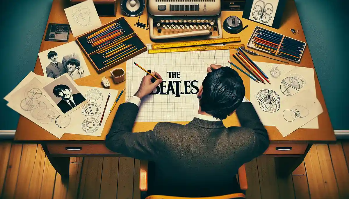
This globally famous logo features a big letter B and a letter T whose vertical stroke extends downwards.
Since it's prominently written on Ringo Starr's bass drum, I imagine many people have seen it even if they're not fans.
- No Beatles without Ringo Starr’s drums!
- Various behind-the-scenes stories about the Beatles
- Supreme guitar riffs from both Japanese and Western music: songs with badass intros
- Why does Paul McCartney come to Japan almost every year?
- I want to try playing the piano! A roundup of Beatles songs recommended for beginners
- The Beatles’ Birthday Songs and Popular Tracks Ranking [2026]
- Songs with titles that start with “ba.” Useful hints for karaoke or shiritori!
- A song with a cool drum intro
- Chosen by professional drummers. Training videos you really should watch.
- Pick-up of famous lyricists who left their mark on the history from Showa-era kayokyoku to J-POP!
- Songs that start with “Be.” Perfect for shiritori, karaoke, and playlists!
- A compilation of Vocaloid songs with titles that start with “Be”
- Songs with titles starting with 'bi' (such as Believe and Beautiful)
The globally famous 'The Beatles' logo
Although it has no ornamentation and is extremely simple, I think it is a truly wonderful design.
Now, here’s one question.
Who on earth designed that logo?
A member, or a professional artist?
This time, I'd like to research this.
It wasn't that logo from the beginning.
That logo is, "Drop-TIt is called.
The name comes literally from the fact that the vertical stroke at the end of the letter T extends lower than usual.
Although this logo was not used on the original album released in the UK, it still began to be used relatively early on.
And starting in 1963, it began to be displayed on Ringo’s bass drum and has been used as the official logo ever since.
Incredibly, in 1960 they were handwriting it on paper and pasting it on!
The familiar logo finally appeared in 1963.
This is the logo from when it was photographed by the photographer Albert Marion on December 17, 1961.
That was back when Pete Best was still a member, wasn’t it?
He was dismissed in August 1962, but this is probably the only photograph of him sitting at a drum kit with the 'The Beatles' logo.
Paint has been airbrushed onto the bass drum skin; the word “THE” is decorated, but the word “BEATLES” is nothing out of the ordinary.
The text is small, and it’s too subdued, so it lacks impact.
The emergence of the so-called 'bug logo'
Paul McCartney was coming up with various designs to represent the band name and writing them down on paper.
For section B, they probably had the antennae of a rhinoceros beetle in mind.
However, as you can see, it was still just a rough draft rather than a full-fledged design, and it was a far cry from a drop tee.
Next came a logo for “B” that looked like it had a rhinoceros beetle’s horn.
This is "Bug LogoIt is referred to by the name “(insect logo).”
This was handwritten with gouache, a watercolor paint, on a wax-coated cotton band of fabric measuring 20.5 x 59.5 cm by Tex O’Hara, a craftsman from Liverpool, based on Paul’s earlier draft.
I made several pencil sketches and eventually created two versions of the same design, one in black and one in brown, but the Beatles chose black, saying that black was fitting for a rock band.
This is from when they appeared on the TV program “Thank Your Lucky Stars” on February 17, 1963.
This is the bass drum that Ringo first played with 'The Beatles' written on it.
But since you were going to appear on TV, couldn’t you have presented yourself a bit more properly?
It really has a very homemade feel to it, though…
Well, this design isn’t all that bad, but being hand-drawn, it inevitably feels a bit cheap.
Replace apple and drums
Ivor Arbiter was born in 1929 in Balham, South London.
He worked as a part-time drummer, but in the late 1950s he opened a musical instrument shop called Drum City along Shaftesbury Avenue.
It was the first drum specialty store in London.
The shop was modeled after American outlet stores and became widely known among jazz drummers as a specialty drum store.
He also opened a guitar store called Sound City, and the Beatles bought a lot of equipment there starting in 1963.
Actually,The birth of that “Drop-T” logo was a matter of pure chance.It is.
In April 1963, Ringo and manager Brian Epstein came to the shop to look for a new drum kit to replace the one Ringo had been using, known as the 'Stars Premier Kit.'
This is the kit I had been using until then.
I bought it when I was returning from the tour in Hamburg in September 1960.
Even after he became an official member of the Beatles, he continued to use this during live performances and recordings.
For example, they recorded songs like “I Saw Her Standing There” with this drum kit and used it until May 12, 1963.
The Arbiter says this.
I got a call from a clerk saying a customer named Brian Epstein and a drummer were at the shop. The drummer turned out to be Ringo, but I didn’t clearly remember his name. I didn’t even know the name ‘the Beatles’ at the time. Back then, every band wanted to make it big.
Ringo fell in love at first sight with Ludwig’s new Oyster Black Pearl.
It was 238 pounds, but Brian didn’t want to buy it.
They probably thought it was expensive.
However, the arbiter felt he couldn’t send the customer away empty-handed, and as a result of the negotiations, he astonishingly handed over a brand-new Ludwig in exchange for Apple’s old Premier kit!
It may have been thanks to Brian’s skillful negotiating, but even so, it was a startling move—practically giving it away for free.
But it's 238 pounds?!
The exchange rate at that time was a fixed rate of 1 pound = 1,008 yen.
That comes to 239,904 yen when you calculate it.
Converted to today's monetary value, it's approximately 1.2 million yen (!)
However,The Arbiter asked Brian to put the Ludwig company name on the bass drum.。
That's because he had just started doing business with Radic, so he wanted to promote the company name even a little.
Brian agreed to it, but at the same time requested that it also be written as “The Beatles.”It is (that).
Moreover, I specified that it should be drawn even larger than the Radik logo.
You're as sharp as ever in this regard.
Because there's no place as noticeable as that for promoting a band name.
Even before the Beatles, there were bands that displayed their names prominently on the bass drum, but I don’t think any band had it written this large.
In the end, Arbiter’s plan hit the bullseye.
Thanks to the Beatles’ massive breakthrough around the world,Radic suddenly rose to become a global drum manufacturer.Because.
“Drop-T” is finally born!
Brian took a scrap of paper from the desk drawer and handed it to the Arbiter.
There were two roughly sketched logo drafts there.
His request was quite simple: just emphasize the word “BEAT.”
The Arbiter who received the order hastily sketched several designs for a new logo on scraps of paper.
He picked up one of them and, just as Brian had ordered,We emphasized the word “beat” by enlarging the letter B and extending the vertical stroke of the T downward.。
I made the remaining characters symmetrical left to right and matched their heights.
Yes, this is truly a memorable one worthy of being passed down to posterity.“Drop-T” logoIt was!
For the design fee, Drum City received five pounds, and a local craftsman, Eddie Stokes, painted it on the drum.
This is it.
Brian hadn’t given any detailed instructions; it was purely the product of Arbiter’s ideas and Stokes’s craftsmanship.
Both Ringo and Brian were satisfied with the result, and after various changes over the years, the Beatles’ logo finally settled into place.
From then on, while this design underwent repeated minor revisions, it was never significantly changed.